
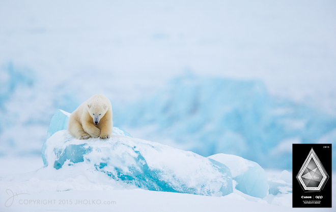
In August this year (2015) I took a small film crew (Untitled Film Works) with me on a photographic expedition to the very edge of the permanent pack ice, high above the Arctic circle. At our most northerly position we were a mere 500 nautical miles from the North Pole. The film crew documented our expedition as we searched for and photographed the increasingly rare, elusive and threatened Polar Bear. During the expedition we also photographed stunning Arctic landscapes as well as other Arctic wildlife including Walrus, Arctic Fox, Reindeer, and more. It was our intention to capture and share the experience of what it is actually like to travel on a dedicated photographic expedition with a small group of passionate photographers. I am now thrilled to release the short movie of our experiences – Kingdom of the Ice Bear. Be sure to dim the lights, crank up the volume and enjoy. My sincere thank you to Untitled Film Works and all of those participants who partook in this extraodinary expedition – thank you. Just click on the image below to play the movie. If you are interested in travelling to the Arctic to Photograph Polar Bears in their natural environment I will be leading two expeditions in 2016 (Sold Out) and 2017. Please email me for additional information or to register your interest.
Month: October 2015
South Georgia and Antarctica 2015 Packing List
In just under a week I will be making the long journey from Australia to the Falkland Islands for my 2015 South Georgia Photography Expedition. The South Georgia island expedition is actually the first of four back-to-back expeditions. At the completion of South Georgia Island I will stay on in the Falkland Islands with a small group of photographers for a week photographing the incredible birdlife on both Saunders and Sea Lion Island. I will then head back to South America where I am going to fly down to Union Glacier in Antarctica on a Russian transport jet (less than 900 miles from the South Pole) for a seven day scouting trip to a very remote region of Antarctica. At the conclusion of this scouting trip I will fly back to South America and board ship for one more Antarctic expedition to the Peninsula for the year. It is going to be a really busy couple of months and I am very much looking forward to sharing the experience with all on these expeditions.
As has become traditional I like to do a packing list post before I depart on an expedition. The purpose of this list is to both help me make sure I have not forgotten anything, but also to share what it is I take with me for those either travelling with me on these trips or considering their own future trip. In this instance I am packing for four back to back photography trips – South Georgia Island, the Falkland Islands, Union Glacier Antarctica and finally the Antarctic Peninsula. Each of these trips are not too dissimilar in their requirements so I have been able to keep my list to a fairly manageable level. Gura Gear Bataflae 32L Camera Bag (Carry on Luggage)
– 2 x Canon EOS 1DX bodies
– 1 x Canon EOS 5DSR body
– 1 x Canon 11-24mm F4L Lens
– 1 x Canon 24-70mm F2.8L IS MK II Lens
– 1 x Canon 70-200mm F2.8L IS MK II Lens
– 1 x Canon 600mm F4L IS MKII Lens
– 1 x Canon 1.4TC MKIII
– 1 x Canon Drop-in Circular Polariser
–
Gura Gear Chobe (Carry on Luggage)
– 1 x Apple MacBook Pro 15″ Retina
– 1 x Apple laptop charger
– 1 x Thunderbolt 1 TB external portable hard drive
– 1 x USB CF card reader
– 1 x Sunglasses and sunglasses case
– 1 x Astell & Kern Hi-Rez Portable Audio Player
– 1 x Astell & Kern Charging Cable
– 1 x Inner Ear Stage Two Driver Headphones
– 1 x Leica Ultra-vid 10×42 HD Binoculars
–
Etcetera Case #1 (Inside Chobe)
– 1 x Canon 1-Series camera charger
– 2 x Power Adapters for on board ship
– 2 x Canon 1DX spare Batteries
– 2 x Canon 5DSR spare Batteries
–
Etcetera Case #2 (Inside North Face Duffle)
– 1 x Arctic Butterfly Sensor Cleaner
– 1 x Filter Wrench
– 1 x Zeiss Cleaning Fluid and Lens Cleaning Tissue
– 1 x Micro Fibre Lens Cloth
– 1 x Rocket Blower with Hepa-Filter
–
There is one other important piece of documentation I will be taking with me on this expedition and that is an Australian Customs Declaration form. If you are travelling internationally from Australia you can read about the benefit arming yourself with this documentation HERE.
The Bitter Sweet
It is always somewhat bitter sweet for me to be heading overseas on a photography expedition. On the one hand I love spending time in the outdoor polar regions with other photographers who are passionate about their craft. I am fortunate to meet and travel with some fabulous people who are not only talented photographers in their own right but also a source of continual inspiration. Many of these participants have become friends and I just want to take a moment to acknowledge their photography and thank them for their participation and input. The bitter for me is that I am leaving my two young kids for an extended period of time. Thank goodness for technology and Skype.
See you in the Falklands!
Book Review: Arctique by Vincent Munier
The final book review I am publishing for 2015 (I will be travelling again soon until the end of the year) is the new release from contemporary wildlife photographer – Vincent Munier. If you are not familiar with Vincent’s photography then you more than owe it to yourself to take some time out of your day and get to know his work. Vincent is a master of wildlife photography and his latest tome ‘Arctique’ is going to be the subject of this review. 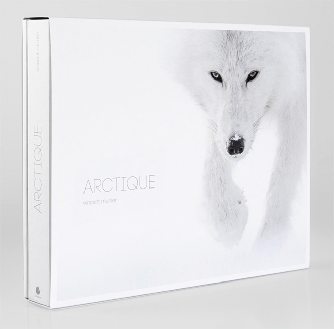 I have been eagerly awaiting the arrival of Arctique since it was announced a couple of months ago. I already own several of Vincent Munier’s books including La Nuit du Cerf (reviewed here on this site) as well as his two volume ‘Solitudes‘ and also own several of his other smaller publications. I regret, I do not own his out of print Kamchatka book (if anyone has a copy they wish to part with please let me know). I am also soon to count one of his fine art prints amongst my collection. The new release, Arctique is a collection of wildlife (and landscape) photographs from the Arctic regions of the globe. It includes some previously published work as well as new photographs. From Vincent’s website:
“Vincent Munier showcases his best pictures from the Arctic. He brought them from different polar expeditions lead in winter during the past 6 years, generally alone and with full autonomy.
In the cold, pulling heavy sleds, he walked and skied across hundreds of miles on the territories of the white wolves: the « ghosts of the tundra », as the Inuit have named them.
From Scandinavia to the northenmost islands of Nunavut (Canada), we are invited to discover a breathtakingly beautiful, fascinating wild world: polar bears and foxes, caribous, muskoxen, Arctic hares, snowy owls… and even a magical encounter, when a pack of nine wolves surrounded the photographer!
Munier’s unique pictures carry us away on a long and adventurous journey across the open spaces of the far North; their gentle, white atmosphere softens the real harshness of this gigantic desert, at the top of the world. And for the first time, the photographer shares with us his travel journal and personal impressions of the Arctic, one the most remote and fragile places on the planet.”
If you are not familiar with the style of Vincent’s wildlife imagery Arctique might seem somewhat alternative to you on first leafing through the pages. You will not find cliché images, or documentary style photography in-between the covers of Arctique. What you will find instead is highly evocative imagery that is rich in emotion and drama and that is presented in a very soft and ethereal manner. This is imagery that whispers in soft transcendent tones and does not feel the need to shout and wave its arms and legs about.
What I particularly enjoy is what is left to to the imagination in these photographs. Photography is very much a subtractive process. When framing an image in the viewfinder what we choose to exclude is often more important than what we include and it is this skill that Vincent employs so artfully in Arctique (and in his previous release La Nuit du Cerf). This has become Vincent’s trademark style and Arctique contains numerous wonderful examples in its many pages. The photographs provide us a glimpse into a mystical frozen Arctic world. They tell us stories about the lives of these incredible animals; about their ability to adapt and survive and the interactions between them. But these stories are not presented chapter and verse. Instead we are provided with just the right number of ingredients for our mind to take us on a journey and let our imagination complete the stories. This engages the viewer on a far superior level to a collection of ‘pretty pictures’. Everything is there to set the stage for a great photograph: Low mist, fog, falling snow, dramatic cloud and light, are all in abundance, but it is the choice of framing and shutter speed that bring the image to life and the soft muted pallet that paints the subject in such a mysterious shroud. We are often left with a sense of the environment in which the animal lives – as if we are provided a partly fogged window with which to look into this remote world. This is artful and soulful wildlife photography executed by a master craftsman. It is wildlife photography at its absolute best.
Presentation – We all know that first impressions count. From the get-go the presentation of Arctique is absolutely superb. From the moment I opened the packaging and removed the shrink-wrap, to the moment I turned the final page and closed the book I was engaged by the complete package. The presentation is extraordinary, and rates amongst the very best I have seen in photographic publications. It is rare for me to be left wanting more at the end of a book, but that is exactly how I felt when I got to the end of Arctique. I had devoured the imagery, enjoyed sublime presentation and was still hungry for more. It was not long after that first viewing that I found myself going back for second and third helpings.
Hardbound on wonderfully heavy art paper (I would guess close to 200gsm paper) Artique is a sizeable publication; consisting of 264 pages (plus an additional 48 pages of travel journal). The choice of a matt Arctic white colour for the cover is complimentary to the photographs and the entire book is a very well constructed package that exudes quality. I really enjoyed the small touches such as the thoughtful matching slipcase (also presented on lovely card stock) and the clever addition of the behind the scenes (travel journal) softcover book included inside.
The travel journal offers a wonderful insight into the making of the photographs in Arctique that really added great depth to the overall experience for me. Having spent many months photographing in the Arctic regions myself I can already appreciate what it took to produce these works. My feeling, is the behind the scenes additions will provide a much deeper level of appreciation for this body of work for those who have not had the good fortunate to visit the Arctic. I particularly enjoyed the small diary excerpts (in French) included therein. The addition of the travel journal will I think for many complete the experience and is a worthy addition to Artique that takes the entire package into that rare air of excellence.
I was very pleased to see a complete lack of full bleed photographs in Artique. All of the photographs are framed by the white of the paper and this works exceptionally well to contain the imagery from page to page. Each photograph is treated as an individual art piece – and rightfully so. I particularly enjoyed the layout of this book and the use of small photographs on some of the pages to draw me in and create a greater level of intimacy. In an era where big is often seen as better it is nice to see the use of small images employed to help draw the viewer into this mystical polar world. This technique is highly effective at viewer engagement and more photographers would do well to take notice. I also appreciated the occasional use of an empty page on the left hand side that allows the eyes and mind to take a slight pause and focus on just one photograph on the right hand side of the page. This is clever design that lets the eye really take in and enjoy each photograph without feeling overwhelmed. Presenting a 264 page book of photographs that continually engages the viewer is extraordinarily difficult and most books of this size leave me tired well before I get to the last pages. The simple reality is that there are only so many photographs my brain can absorb in a single sitting before the images start to blend together. Artique transcended this limitation for me and left me wanting more. That is an extraodinary accomplishment.
Print Quality – In many ways reviewing the print quality of Arctique had me reflecting back to my earlier review of Vincent Muniers La Nuit du Cerf. The difference being, the palette has been reversed. La Nuit du Cerf contained photographs that were very dark in nature (many of them shot at night) where as Arctique has a much whiter and brighter pallet that is a strong example of the use of subtle shades of white and delicate tonal transitions. There are many examples of white on white in Artique and the eye takes great pleasure in the subtle tonal shifts.
It is had to make a direct comparison to my Gold standard for book printing – the 2014 APPA Gold Award Book as the two printing processes employed in these two very different reproductions are (pardon the pun) poles apart. Where as the 2014 APPA Gold book has an incredible D-Max with deep, rich velvety blacks, superb color reproduction and pin sharp printing; Arctique employs a different approach that perhaps more appropriately matches this style of photography. My feeling is that the print quality in Artique is best judged in the subtle tonalities of snow and ice found in many of the images and not in direct comparison with other publications.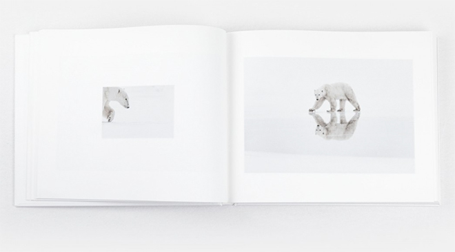 I feel somewhat spoiled in my experience with print quality. As a photographer who regularly makes and sells fine art prints I have a pretty good grasp of just how good modern day fine art inkjet prints can be. To date I have not yet seen an offset printing process that can match that of a finely crafted inkjet print. In this regard, the print quality in Arctique is about as good as offset can achieve with current technology on this type of soft art paper and in that respect it is excellent. The choice of matt art paper is highly complimentary to the photographs and the muted palette of soft Arctic whites is well reproduced throughout this book.
I fear those photographers who eschew technical perfection above all else may well fail to grasp the true beauty of the printed images in Arctique. With the limited dynamic range of the soft art paper and the very limited color palette of many of the images there is an over arching soft and ethereal presence to the photographs that is often monochromatic in nature. These are photographs that do not leap of the page with vibrancy. Rather, they softly whisper sweet tones that will draw you into this mystical white world.
Conclusion – Arctique epitomises just about everything I love and enjoy about wildlife photography in a book. It is a superb collection of highly evocative photographs that is an absolute pleasure to consume. Arctique can be purchased online for 65 Euro plus shipping in standard edition (as reviewed here) or, for 500 Euro as a limited edition (100 copies only) in a presentation box with a signed fine art print.
I highly recommend you consider adding Artique to your collection of photography books. If you are not yet collecting books on Nature photography then this would make a superb start and provide you many hours of enjoyment (as well as providing a valuable reference). If you are already a collector of fine photographic publications then Arctique is a must have addition to your library. Highly recommended.
Overall Review –***** Must Own. No photography library is complete without this book.
2015 APPA – Australian Professional Photography Awards
This weekend past saw the annual running of the 2015 Australian Professional Photography Awards (affectionately known to all those who enter as APPA). For those of you who may be unfamiliar with APPA you can read my previous blog post on the awards HERE. In short, if you want to see where the bar is set for world class photographic images and prints you need look no further than APPA. I am always buzzing with nervous anticipation during the APPA judging. The spine-tingling anticipation of having my work scrutinised for any minutia by my peers gets my heart racing. It’s not even the fear of scoring poorly that puts me on edge; its something far less tangible that I can’t quite put my finger on. If you have never entered or attended the APPA awards that probably sounds a little strange, but for those of you who have entered before you will know exactly what I am talking about. Its a special competition and quite honestly its not for the faint of heart. Its a weekend of heavenly highs for some and crushing emotional lows for others. It’s never wise to take these things too seriously, but on the other hand, APPA is the standard by which professional photographers are judged against each other and is considered to showcase the highest level of photography so one can’t help but become a little emotionally involved.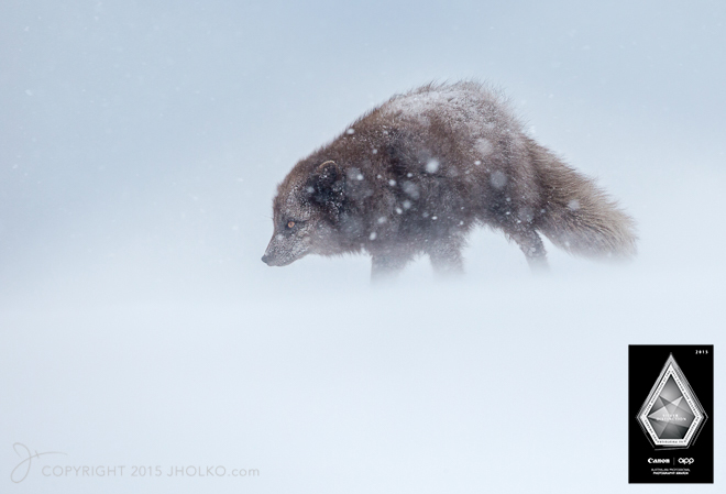
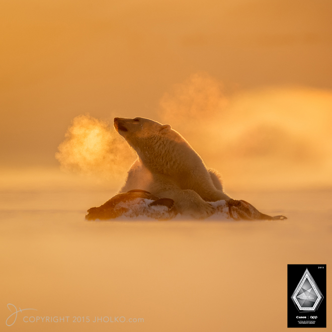

 This was only the fifth time I have entered the APPA awards and it was also the first time I have participated as a judge. This year I again chose to enter the Science, Wildlife and Wild Places category (formally known as the Science, Environment and Nature Category), not only because I won this overall category last year, but also because this category has very rigid rules on image manipulation that are consistent with my own ethics for minimalist post production techniques. This year I chose to enter four images from the Arctic that I felt conveyed strong emotional feelings of wildlife in the landscape in dramatic conditions. I was thrilled to receive four Silver with Distinction awards for my four entries; which placed me in the finals for the overall category win. You can watch the judging of my four photographs my clicking on the image below.
 My current APPA points total now sits just a few points away from my first Gold Bar and I look forward to the challenge of banking these last few points at the 2016 APPA awards next year. I also want to congratulate my good friend and co-guide Antony Watson who this year accumulated more than sufficient points for his Associate status with four silver awards.
Lastly, I want to congratulate Keren Dobia who took this ‘homage to Polar explorers’ photograph of me earlier this year. The photograph scored a highly coveted Gold Award in the Illustrative category.
Eizo CG318-4K Review – The Cutting Edge of High End Graphic Displays
Over the last few weeks I have been working with Eizo’s new wide gamut 4K Colour Edge Monitor, the CG318-4K. This new 31.1” 79cm Hardware Calibration wide gamut monitor represents the current bleeding edge of high end digital monitors for creative professionals. With a native resolution of 4096 x 2160 pixels the CG318-4K is a true 4K display and is capable of accurately displaying an impressive 99% of the Adobe RGB colour space.
 I had been waiting for the release of this monitor for more than six months now. First announced early this year (2015) the CG318-4K has only recently begun to ship both here in Australia and in the US. I admit to being extremely eager to unbox and set up the display when I picked it up from one of the key Australian retailers (Kayell Australia). Eizo Oceania are the importer and distributor here in Australia. I was fortunate to be able to see and briefly test a demonstration unit earlier this year at the AIPP (Australian Institute of Professional Photography) Nikon Event in Perth, Western Australia and was left seriously impressed in a short space of time. This early meeting really only served to wet my appetite to get my hands on one in my own studio and see what it was like to work with such a high resolution wide gamut display on a daily basis. I have been working with a high end NEC 27” SpectraView II monitor for the last five years or so as my primary image editing monitor and was also keen to see what if any advantages the Eizo offered over the NEC. Whilst the purpose of this review is not a direct comparison between the Eizo and NEC it is worth noting that there are some appreciable differences between these screens and that some some direct comparisons are therefore relevant to this review. NEC do have a new UHD SpectraView II monitor on the market; however I have not had a chance to test this device.
 It is worth noting at this point that the Eizo CG318-4K is a true 4K display that displays the full DCI 4K standard of 4096 x 2160 pixels. This goes above the UHD resolution of 3840 x 2160 pixels that is often confusingly marketed as being 4K instead of UHD. Perhaps the easiest way of defining the difference between 4K and UHD is: 4K is a professional production and cinema standard, while UHD is a consumer display and broadcast standard. The DCI 4k standard is more than four times that of full HD (1920 x 1080) and is ideally suited to high end graphics applications such as digital photography and videography. Whilst the difference on paper between 4096 pixels (DCI 4K) and 3840 pixels (UHD) on the horizontal access is only 256 pixels this equates to a sizeable 7% increase in resolution across the entire display that makes for a significantly larger workspace. The image below illustrates the difference and extra resolution offered on the horizontal access by a true 4K DCI display such as the Eizo.
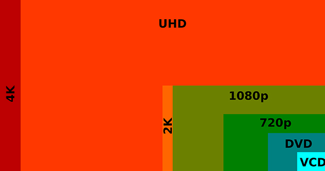 The Eizo CG318-4K has a pixel density of 149 ppi which is well suited for both digital image post production as well as fine art printing applications. If you are used to Apple’s retina displays then you already have a good idea of the performance offered by this sort of pixel density. Regardless, it is well worth taking a couple of minutes to read a short explanation on pixel density and 4K displays courtesy of Eizo’s website. The important take away from this for most users will be to avoid a potentially costly mistake of purchasing a super high pixel density display in the hope of increasing the work space only to realise that magnification has to be used (in order to read text), which means that the work efficiency is effectively the same as before. It is therefore important to select the optimal model with a proper understanding of the features, such as the advantage of super high pixel density displays when it comes to very high definition display and that going with a larger screen size is effective for increasing the work space.
Rather than regurgitate a set of specifications in this review (which are already available on the Eizo website), or present a somewhat spurious set of gamut plots, I am instead going to focus on my impressions of the new Eizo in real world use after working with it in my studio for the last few weeks. My impressions are based on working with images from my Canon EOS1DX 18 MegaPixel Cameras and my Canon EOS 5DSR 50 Mega pixel camera. During my time with the monitor I have been evaluating how the display performs for both processing files and for achieving optimal screen to print matches and will discuss my impressions thus far below. It can be hard to review this kind of product and concisely articulate ones impressions without resorting to superlatives (as so much is subjective once you get past the initial numbers), so please forgive me if I make the occasional subjective statement. This is after all my impression of the display in real world use with my workflow. I am also going to cover the calibration of the display in a short video and demonstrate in a second video the true power of using an Eizo for soft proofing print files; courtesy of the Eizo colour Navigator software. It is this last point that will be of most interest to those of you, who (like me) are interested in making fine art prints of the highest possible quality.
Before I discuss my impressions of working with the new Eizo it is worth addressing the elephant in the room in relation to this monitor and that is the price. At an MSRP of $6000 USD (closer to $7,500 AUD) the Eizo is roughly the equivalent of a fully specified 5k iMac from Apple (without the computer behind it). Or viewed from a different perspective, the iMac comes with a free 5k screen attached. Now, for those of you who are already familiar with the benefits of high end graphics displays such as those from Eizo and NEC you need no explanation of why this is the case. However, if you are new to high end wide gamut graphics displays it is worth taking a moment to understand what it is you are paying for in a screen such as the Eizo CG318-4K and what you are not getting in a 5K iMac screen in comparison.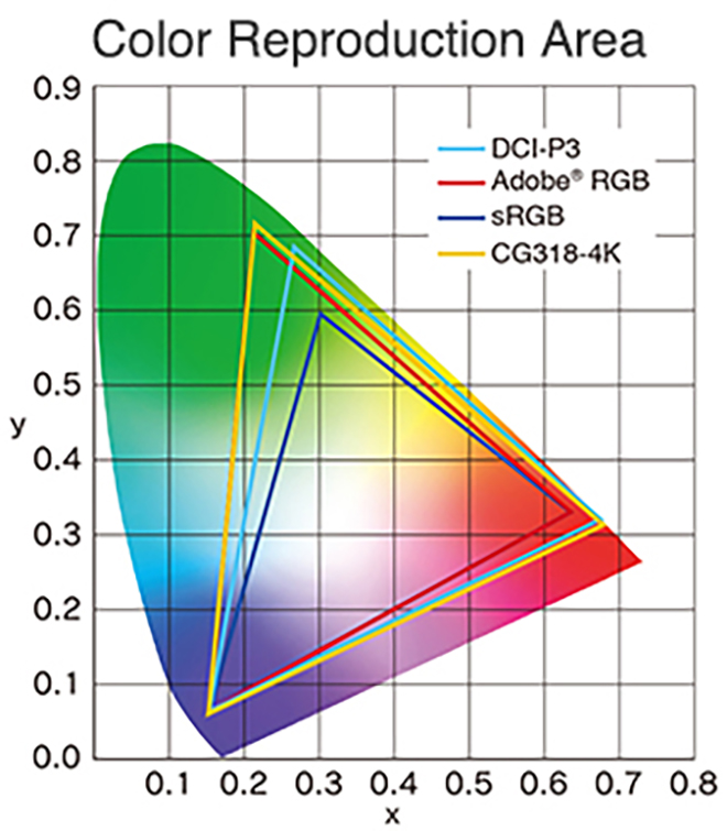 Wide gamut displays such as the Eizo CG318-4K have the capability of displaying a much wider range of colour than the vast majority of computer displays. Most displays (including the 5K iMac) will display colours close to that approximating the SRGB colour space. SRGB is a very small colour space and the default colour space of the internet. It is for all intent and purpose the lowest common denominator in the colour space world. Wide Gamut monitors have the capability of displaying a much wider range of colour (more saturated colours) and typically come close to approximating the Adobe RGB colour space. What this all means in real world terms is the reproduction of much deeper more saturated colours. This enables better rendition of colour tones and better gradation in colour. For image processing and printing this is a key advantage and for photographers is critical to achieving the best possible results. Here in my own studio my wide format Canon printers are capable of producing colours that greatly exceed the SRGB Colour Space (and in some areas even the Adobe RGB Colour Space). The Eizo is capable of rendering these colours on screen and thus I can ensure my images are optimally processed for final print without guess work or test prints.
Another troubling issue for photographers is that the Apple iMac (and other more basic displays) cannot be hardware calibrated. Only a faux software calibration is possible which is a vastly inferior solution. Not to dish out on the 5k iMac too much (I own one of these in my second study area that I use for general internet browsing and email) but its mirror-like display is also a very poor match for making fine art prints, even if the marginal restricted gamut were deemed acceptable. In fact, the first thing you notice about the 5k iMac screen when you sit down in front of it is whatever is directly behind you because it is so reflective. This makes it a very poor choice for high end graphics applications and fine art printing. Now, I grant you that many users and non photographers will find the 5k iMac very pleasing in general use since most general users do not even know what colour gamut means. However, for creative professionals who understand and have a need for a wide gamut display there is simply no comparison.
In terms of both sheer colour range and accuracy of colour reproduction, the CG318-4K performs within a whisker of perfection. Testing shows that 100% of the sRGB spectrum is accurately reproduced, whilst not less than 99% of the Adobe RGB gamut range is also successfully displayed. The much larger Adobe RGB space is much harder to reproduce and most monitors don’t reach even 80% of it (as a reference the 5k iMac produces approximately 78% of the much larger Adobe RGB colour space). There is also the more advanced DCI-P3 (digital cinema color gamut) spectrum and the Eizo manages not less than 98%, according to Eizo (I did not measure this aspect). That’s great news for video editors; who, by the way, can also natively edit RED Epic Camera streams on the Eizo CG318-4K.
Being able to produce all of those colours is not very useful unless a monitor can do it accurately – and here the CG318-4K offers truly superb performance. The measurement of accuracy is referred to as the ‘Delta-E’ . In short, the bigger the number, the more inaccurate the monitor is. My own testing shows the CG318-4K’s average Delta-E is a very small 0.58 and the maximum was .74. This performance is nothing short of exceptional and is unmatched in my experience. The 5K iMac’s average Delta-E by comparison was 1.76 – significantly higher than the CG318-4K’s maximum – with its own maximum being a whopping 5.1. In summary, the CG318K-4K’s accuracy is about as good as you can get, regardless of price.
The colour gamut advantage of displays such as the Eizo are the most commonly known advantage over more typical computer displays for graphics professionals. However, there is another key advantage worth mentioning; which is uniformity. Uniformity refers to the displays ability to maintain even brightness and contrast from one side of the panel to another. The more uniform the brightness the more ‘paper-like’ the appearance of the screen, the easier it is on the eyes and from a photography perspective the easier it is to judge tone and contrast in a given area of an image. Uniformity is extremely important in the reproduction of fine art prints since it ensures an even contrast ratio across the monitor.
Even uniformity is difficult to achieve in back-lit monitors and is often one of the first things you notice in a poor quality display. Monitors that are brightest in the middle and fall off in the corners are common place and are a very poor choice for creative professionals working with digital images. Uniformity can easily be measured and in my own tests I find no measurable difference across the face of the Eizo (which is astounding performance). By comparison the iMac in my study measures a difference of more than a stop from corner to corner. This difference is clearly visible to the naked eye.
CALIBRATION
Unlike most high end graphics displays the Eizo CG318-4K does not require an external instrument or colorimeter to calibrate the display. Rather the Eizo has its own built in instrument that automates and significantly simplifies the process. This might seem like a small trivial thing, but in real world applications this is quite a time saving feature that I have already grown very fond of. With my previous display (an NEC 27” SpectraView II Monitor – also a very fine display) I would have to pull out my colorimeter every couple of weeks or so and recalibrate the screen with the SpectraView II software. This process only takes ten minutes or so, but over a period of time it can become quite tedious and I admit that on occasion I have let a calibration slip past its due date due to sheer laziness. The Eizo takes this calibration and fully automates and schedules the process so that I no longer have to worry about it. I can now sit down in front of my monitor and know it has been calibrated as often as I wish to set the schedule. The calibration sensor is housed inside the top bezel of the screen and swings down onto the screen when calibration is taking place and then swings back up out of the way when not in use. The design and implementation is extremely slick and makes manually placing an instrument on the screen seem positively prehistoric. If the monitor is in standby mode when its time for a scheduled calibration the screen will wake itself up, spend ten minutes warming up and then perform its self calibration function before going back to sleep. A scheduled calibration can be cancelled at any time if its timing interferes with your work. The other key advantage to having a built in sensor is Eizo can ensure the instrument is correctly calibrated and optimised for the display.
Eizo’s Colour Edge Navigator software (ships free with the display) is very easy to set up and use and offers all of the features one could want and need for photographic and video purposes. Also included is Colour Navigator network software for centralised administration of Colour Edge monitors tied to a single network with an enterprise infrastructure. The matching Colour Navigator colour management software that ships with the monitor makes accessing, activating and deactivating specific Colour features (or turning on and off the built in calibration modes) a very simple task. As an interesting aside I was pleased to see the addition of touch sensitive virtual buttons on the monitor in lieu of physical hard press buttons.
For those working with Broadcast and Cinema settings there exist preset modes for EBU, Rec. 709, SMPTE-C and DCI which makes working in any of these colour spaces and gamma values as easy as touching a button on the screen. For even further customisation the in-built calibration sensor and software allows you to adjust the brightness for each of these presets. The customisation options are very thorough and their implementation optimised for just about any workflow. The software is intuitive and very easy to use.
Click on the image below to watch a short video to see Eizo’s Colour Edge Navigator Software in Action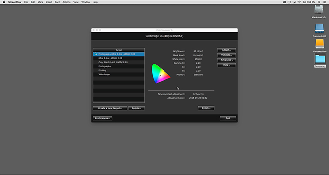 REAL WORLD USE
In Real world use here in my studio the first thing you notice on turning on the display is the incredible resolution that a true 4K screen provides and the subsequent desktop real estate that this resolution enables. I had been concerned that text may be rendered to fine to read but have found that (even though it is small) it is actually quite legible in daily use to my eyes. I suspect your mileage may vary depending on the quality of your vision and viewing distance. In my studio I sit quite close to the monitor and have (as of last test 20/20 vision) no problem reading text on screen without the need for any software scaling. Daily life in a true 4K environment under MAC OS X just works provided you have good enough eye sight to read the small text. If (like me) you like to work on a single monitor then you recognise the high value of having significant desktop real estate; something the Eizo provides in spades. Colour rendition is nothing short of superb on the Eizo and the sheer resolution a true native 4k display offers makes for a powerful and incredible work space.
The other immediate thing I noticed was just how incredibly uniform the brightness is on the Eizo. I am used to working with high end graphic displays and have owned quite a few over the last few years including those from the NEC SpectraView II Line. None of them have hit me with the immediacy of the new Eizo. In side by side comparisons there is a noticeable (although subtle) difference in the uniformity between the Eizo and the NEC 27” SpectraView I have been working with for the last few years. This is not to say the NEC looks bad – far from it. It is just that the Eizo looks ‘smoother’ and more ‘paper-like’. Testing shows the NEC differs by one third of a stop from edge to edge in comparison to the Eizo (which is still excellent performance). The NEC also looks a little soft by comparison to the Eizo in side by side comparisons and clearly suffers from its lower resolution (2560 x 1440) in this regard. A fairer comparison would be to compare the Eizo to the New NEC UHD SpectraView monitor (3840 x 2160), but there was not one available for me to test at the time of this review.
My daily use for a monitor such as the Eizo involves the editing, post production and printing of digital files in Adobe Lightroom and Adobe Photoshop Creative Cloud. I also use applications such as in-Design, Premiere Pro and other image related programs and plug ins. On the whole most of my time is in the majority spent in Lightroom and Photoshop and thus this is the area that my comments are most related.
Working in Adobe Lightroom on the Eizo CG318-4K is an absolute revelation. It has always bothered me that the side panels in Lightroom are fixed and not tear away (yes, they can be hidden, but I prefer tear off). The Eizo has so much screen real estate and resolution to play with on the horizontal access that the fixed panels are now an absolute non issue for me. I used to have to hide the panels to gain resolution for the actual image on the horizontal axis for a standard 35mm ratio image. On the Eizo however, the extra screen real estate provides sufficient resolution to negate this need and the side panels can now be left open all the time. This might seem like a very small benefit, but in real world use its actually extremely beneficial to my workflow. Again, your mileage may vary.
Contrary to what I have read on the internet in various places I experienced absolutely no issues with Lightroom or Photoshop running slowly with a 4K display. I suspect any such issues are almost certainly related to video cards being driven to their limit (and beyond).
Images in Lightroom (and Photoshop) are breathtaking to behold on the 4K Eizo and are rendered with superb clarity. In fact, even bad (noisy) images look good on this display and I have caught myself starting to process images that I would have potentially glossed over on my previous display. The resolution is so fine and the images are so sharp and superbly rendered that it is easy to be seduced by the sheer clarity and resolution and loose focus on the content. I would suggest that if you are preparing images for the web it might be worth just proofing them on a lower end monitor to see what they are going to look like to the majority of people on the internet.
Working with images in Lightroom and Photoshop is a joyous experience on the 4K Eizo and its not just because of the incredible resolution this screen offers. The colour rendition is absolutely superb and when combined with the incredible uniformity the Eizo offers it is extremely easy to judge tone and contrast when processing RAW files. Soft proofing images with the 4K Eizo has never been easier thanks to its incredible uniformity and hyper accurate colour (and powerful Colour Navigator Software). For those of you who place a large emphasis on printing (as I do) you will find the Eizo to be absolutely second to none in this regard. With its wide and hyper accurate colour gamut and superb uniformity I now get better print to screen matches than ever before. The Eizo represents (for me) the best display upgrade I have made to date. Yes – I ended up purchasing the display and by way of full disclosure, paid very close to the MSRP.
Eizo’s colour navigator software offers some very advanced features for soft proofing images before making a print including the manual tweaking of individual colour hue as well as white balance and brightness for achieving optimal screen to print matches.
Watch a short video to see the Advanced Soft Proofing Capability of the Eizo CONCLUSION
If you are considering purchasing an Eizo CG318-4k monitor for your image work you should be aware of the potential pitfalls in driving such a high resolution display. To date, there are only a handful of graphics cards capable of fully driving this monitor to its native resolution and Eizo provide a list of those cards and computers as tested on their website HERE (note: There may now be additional video cards on the market that are capable of driving this display not on Eizo’s list). In my studio I am driving the Eizo with the new Apple Mac Pro 2013 (the Trash Can) with dual V500 Video cards. The dual V500 video cards can fully drive the new Eizo at its native resolution at 60Hz via the display port connection. My previous 2010 Mac Pro Server cannot drive this monitor with its standard Apple supplied video card and my late 2013 MacBook Pro also fails to fully drive the Eizo to its native resolution despite Apples specifications to the contrary. The Macbook Pro will drive the screen to UHD resolution however. I therefore recommend you double check your own video card capabilities before purchasing this monitor and if possible arrange a demonstration or test.
Other than the price there really isn’t anything not to like about the Eizo CG-318-4K. I guess I could niggle that the dual HDMI 1.4 ports should really have been HDMI V2. on a monitor of this calibre (which would have provided users more flexibility). However, I am sure the majority of users of this monitor will want to connect it via one of the 1.2 spec. Display ports so as to fully drive the 4K display at 60Hz. In terms of connectivity it is worth noting the nice addition on the side of the monitor of a USB hub with 3 USB 3 ports; including a port suitable for charging devices. It would have also been nice to have some clips for cable management on the back of the monitor; but this is at the end of the day nit picking and a trivial omission.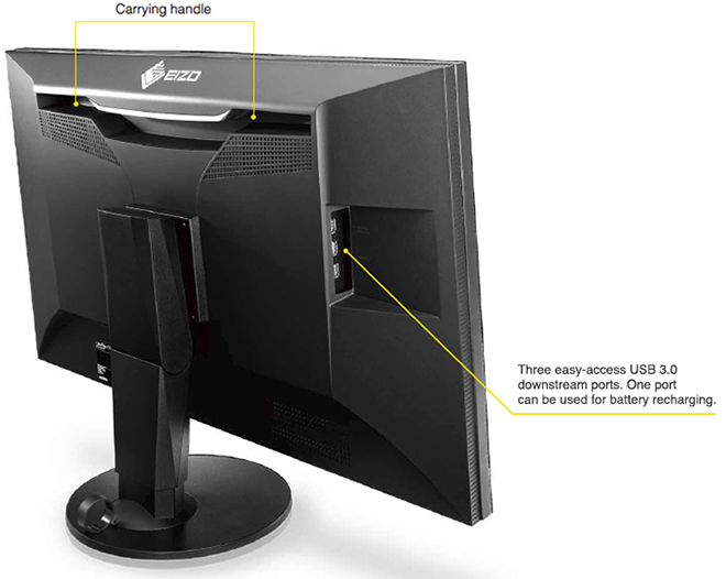 At an MSRP of $6000 USD the Eizo CG318-4K is clearly not for everyone. However, if you are a creative professional or a keen photographer (with the means) who wants and/or needs to work in a 4K wide gamut colour managed environment or requires the highest levels of colour accuracy and uniformity then you will be very well served by the Eizo CG-318-4K. With a 5 Year warranty that includes a zero bright pixels guarantee for a period of six months as well as a 10,000 hour guarantee for colour and brightness, the Eizo represents the current state of the art in graphic displays for creative professionals. The resolution, colour reproduction, accuracy and uniformity are simply superb. Highly recommended if you have the means.
Addendum:
Since I wrote this review Apple have announced a range of new 4k and 5K iMacs. These new iMacs have a quote “wider color gamut” that “makes more of these real-life colors available on the Retina display. A striking 25 percent more.”
With the release of these new iMacs Apple has shifted to the “all‑new” DCI-P3 color space and changed the game. This change will no doubt create some confusion in the market place as users of these new iMacs come to grips with the DCI-P3 color space in their workflows.
The DCI-P3 color space is an RGB color space that was introduced in 2007 by SMPTE. The DCI-P3 color space features a color gamut that is much wider than sRGB and was originally designed for cinema projectors and not displays. The image below shows the relative differences between these color gamuts. In layman terms the Adobe RGB Color space can reproduce more saturated greens that the DCI-P3 color space and the DCI-P3 color space can reproduce more saturated reds.
The Adobe RGB Color space covers approximately 86.98% of the DCI P3 color space. DCI-P3 covers approximately 93.6% of the Adobe RGB color space. However, the DCI-P3 color space uses different green and red primaries to Adobe RGB (but uses the same blue primary) so the measuring stick is quite different.
Eizo quote 98% of the colors in the DCI-P3 Color Space for the CG-318 Display. Apple do not quote a number in their press release for the new iMacs. Apple Press Release. However, Apple do quote “better than 99%” in their ‘reviewers guide’ as reviewed by PC enthusiast website Ars Technica. Screenshot included below. 
What this all means out there in real world workflows remains to be seen. But what is clear at this point (and its a very important point) is that the Eizo CG-318 not only displays 98% of the DCI-P3 color space; but also better than 99% of the Adobe RGB color space and this is the key difference to note on paper between the capabilities of these displays.
