As many of my regular readers, friends and fellow photographers know, I love to print. For me, the photographic print is not only the final end result of the photographic process, but is importantly the ultimate expression of my work. The online jpeg is nothing more than a poor facsimile of the finished fine art print; where as the finished print is the medium in which I prefer to have my photography viewed. I really wish I could more easily share my printed photographs with a broader audience(Facebook needs a print sharing service!) and whilst it is possible to visit one of the galleries that represent my photography it is not always convenient or possible; especially for those that are not local.
I have in the past written about my need to print and spoken to the fact that I never really feel like I have finished with a photograph until I have made a print. The journey and process is extremely satisfying to me and the print is the final finish line for each photograph. Honestly, not every image makes it over the line, but those that do give me a great deal of satisfaction.
Over the last few days I have been working on a particular print that has proven to be the most difficult of my career thus far and I want to share how I finally achieved the perfect print of this photograph. It’s not a photograph that translates well in an online jpeg (unfortunately the jpeg compression destroys the tonalities), but it is simply wonderful in its final finished printed form. The photograph was taken last winter in Svalbard during my snow mobile expedition and is a layered white-on-white arctic landscape. The landscape was bathed in a very soft ethereal light when I made this photograph and contrast was extremely low. Super dense cold air hung low in the valleys and a subtle gentle fog softened the distant mountains. The darkest part of the scene was a distant rocky ridge-line, but even it was many shades above black. As a result the scene was high-key, yet it contained no harsh whites or blown out areas. Honestly, outside of getting to this remote location and the freezing temperature (around -30º Celsius) it was not a difficult photograph to make. It has however been a complete bear to process and print. There are literally hundreds of shades of different white in the photograph with extremely delicate tonalities that require just the right amount of finesse to print. Anything less than perfect results in flat areas that lack depth. The heart of the problem is that inkjet printers are not equipped with white ink. So, the whitest white one can achieve in an inkjet print is the natural white of the paper you have chosen (and not all papers are created equal). Hence, paper choice is a critical factor in the fine art printing process. Whilst it is true that lustre and gloss papers have a better d-max (better, deeper blacks) than matt papers I vastly prefer matt papers for their art feel, surface texture and softer finish. I personally find lustre and gloss papers (even the expensive Baryta papers) take away from the evocative feelings I want to portray in my work. As a result virtually all of my printing is on matt paper – specifically Moab Somerset Museum Rag. Somerset Museum Rag is a 300 gsm fine art paper with a subtle surface texture and a wonderfully high white point (with a good solid black point for an art paper). I have been printing with Museum Rag for many years and I have a very good understanding of the capabilities and limitations of this paper. It is absolutely ideal for printing snow and ice images in my experience.
Before I describe the process by which I achieved what I feel is the perfect print of this photograph I want take a few steps backward and start at the beginning of the process. The real key to making a fine art print is to start with a great capture. Anything less than a great capture will never be a great print – period. By a great capture, I mean an image that has been well exposed with its histogram biased towards the right hand side (without clipped highlights) , sharp where it needs to be and free from excessive noise. Once you have a great capture you need to carefully process the RAW file to bring out the best in the photograph (a totally seperate skill to the capture process). In the case of this photograph I took extreme care with contrast and highlights to gently pull out all of the subtle tonalities in the highlights in the file. There would be a strong temptation amongst many to bring down the blacks in this file until the rocky ridge-line had a hard deep solid black; but thats not how the scene was in reality and such artificial contrast would look extremely unnatural. As subjects get further away from our eyes they naturally loose contrast and bleed off into the distance. Artificially adding too much contrast will add impact, but it does so at the expense of image depth so you have to tread very carefully. This is of course an artistic decision, but in my case I wanted to print the scene as I remembered it and not create something that did not exist in Nature. All up, I probably spent an hour or so processing and re-processing this file until I was happy with the end result. Only then can you consider making a fine art print of the photograph.
At this point the first thing you need (other than an actual printer) is the best profile for your printer, paper and ink that you can lay your hands on. On no account should you compromise on the quality of the profile and on no account should you even consider using a canned generic profile. You absolutely must have a custom made high quality profile that you either made yourself, or had someone (who knows intimately what they are doing) make for you. I make own own profiles with an X-Rite ISIS2 and with a friend using his Barbieri Spectrophotometer. There are key differences between these units so I use both depending on what paper I am profiling.
Assuming you have ticked all the above boxes how do you then print a photograph that is basically a thousand shades of white on a piece of white paper with a printer that doesn’t use white ink?
The answer is you have to understand what the white point of your chosen paper is and what is the brightest white you can print on that particular paper. Without this information you have little chance of actually rendering all those subtle white tonalities and shades in the print. In my case, I started by actually measuring the white point (and black point) of Somerset Museum Rag which turned out to be 90.3 with a Dmax of 3.2. I then used this information to modify my custom profile to ensue my whites would not be blown out during printing.
I then created a test chart as below that has shades of white and black from 0 (black) to 255 (pure white). I then printed this test chart with my custom modified profile for Somerset Museum Rag, allowed it to dry and then critically examined it in my Graphiclite print booth to see how much highlight and shadow gradation I was actually achieving. In my case (and with my eyes) I can see highlight detail in my test print all the way up to 253 and shadow detail all the way down 5. Anything below 5 is the same shade of black to my eyes as the 5 shade. In the highlights anything above 253 (254 and 255) appear as paper white to me. This is an exceptional result on a matt paper and is testament to the quality of the profile used to make the print. Armed with this information I now knew that anything in my file that was above 253 would render purely as paper white and anything below 5 would render as a solid black. In this photograph the blacks are actually all but irrelevant since the darkest shades in the photograph are well above this (but it is an interesting exercise to understand for prints with dark tonalities). I then soft-proofed the image in photoshop with my custom profile and the Relative Colorimetric rendering intent and used a levels adjustment to tweak the highlights. In essence I manipulated the brightest tones in the photograph to bring them down to a point where I could see tonal gradation on the paper. I then used several curve layers to increase highlight contrast in certain tones to compensate for the fact that the front lit paper has a lot less contrast than the back-lit LCD screen. Great care had to be taken with these curves to ensure I kept my highlights under the paper white level. I then made a number of test prints of the photograph making small subtle adjustments to the curve layers to better render the tonalities in the extreme highlights. This was an iterative process that took quite a few prints to get just right.
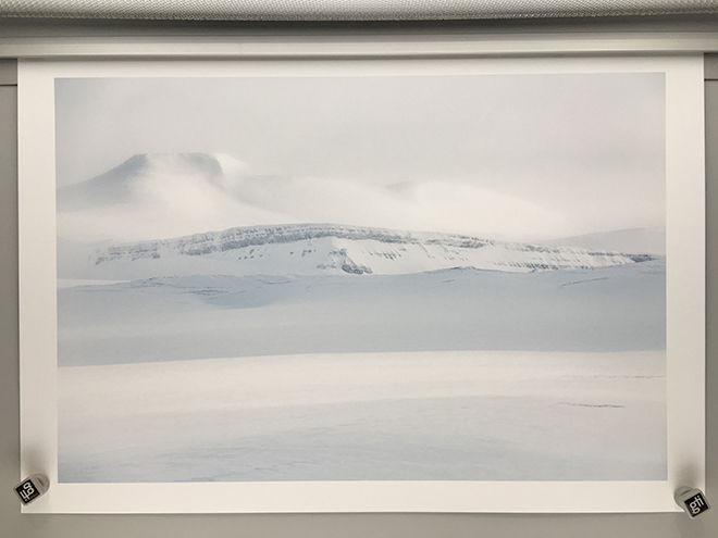 The end result is to my eyes absolutely perfect in terms of its rendition of tone in the highlights. The soft ethereal mountains are perfectly rendered with all of the mystical feeling I remember when I took the photograph. The rocky ridge-line and gentle snow slopes blend their shades of white perfectly; with the foreground having just the right amount of texture and tone. Although I would never enter this print into a competition (most judges would fail to grasp the difficulty of the print) it was one of the most rewarding I have made in recent times.
If you are not printing your work I urge you to make a start and get those 1’s and 0’s off your hard drive and onto paper where they can fully be appreciated. It is absolutely one of the greatest joys of photography.


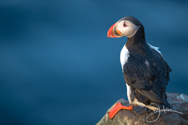
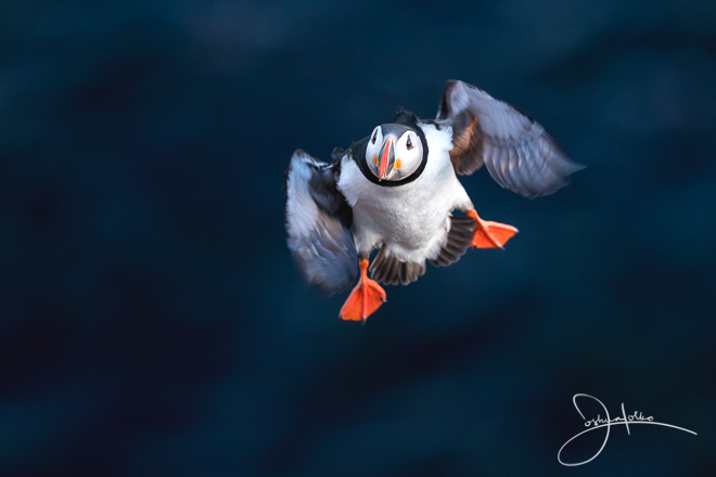
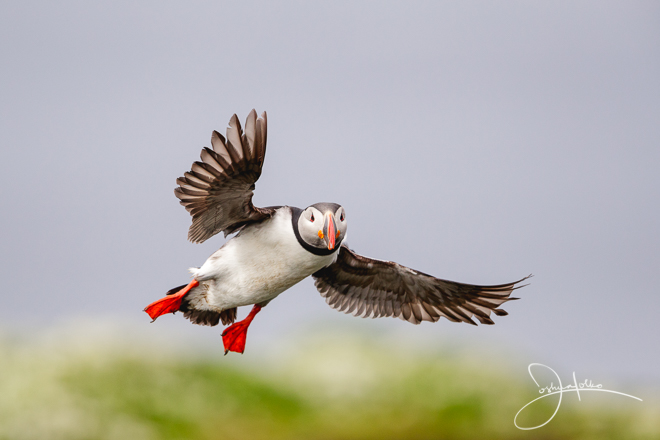
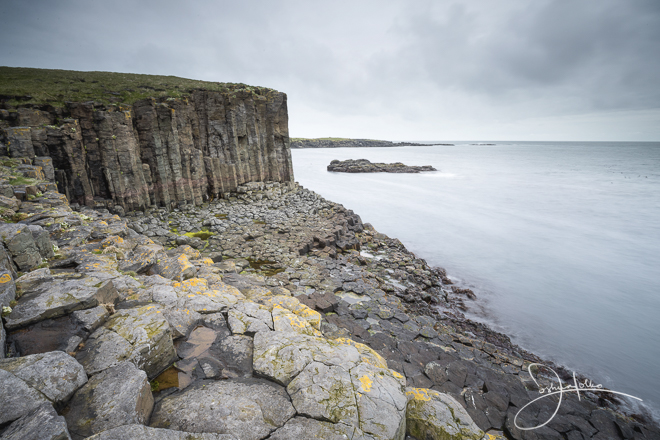
 From Breidavik we travelled to Dalvik to take the car-ferry out to Grimsey Island. This was my first time to Grimsey Island and I can say with a great degree of enthusiasm it was an incredible experience (I am itching to go back!) Grimsey Island is located just inside the Arctic circle and is approximately three and a half hours by car ferry from the northern most part of the mainland. This small island is home to literally thousands of Puffins, Razor bills, Black Guillemots and more. It offers an amazing array of sea cliffs with access from sea level to giant cliffs that soar more than 400 feet high. At this time of year the towering bird cliffs are perfectly aligned with the midnight sun and as such there are simply magnificent opportunities for both wildlife and landscape photography in golden light.