Over the last few weeks I have been working with Eizo’s new wide gamut 4K Colour Edge Monitor, the CG318-4K. This new 31.1” 79cm Hardware Calibration wide gamut monitor represents the current bleeding edge of high end digital monitors for creative professionals. With a native resolution of 4096 x 2160 pixels the CG318-4K is a true 4K display and is capable of accurately displaying an impressive 99% of the Adobe RGB colour space.
 I had been waiting for the release of this monitor for more than six months now. First announced early this year (2015) the CG318-4K has only recently begun to ship both here in Australia and in the US. I admit to being extremely eager to unbox and set up the display when I picked it up from one of the key Australian retailers (Kayell Australia). Eizo Oceania are the importer and distributor here in Australia. I was fortunate to be able to see and briefly test a demonstration unit earlier this year at the AIPP (Australian Institute of Professional Photography) Nikon Event in Perth, Western Australia and was left seriously impressed in a short space of time. This early meeting really only served to wet my appetite to get my hands on one in my own studio and see what it was like to work with such a high resolution wide gamut display on a daily basis. I have been working with a high end NEC 27” SpectraView II monitor for the last five years or so as my primary image editing monitor and was also keen to see what if any advantages the Eizo offered over the NEC. Whilst the purpose of this review is not a direct comparison between the Eizo and NEC it is worth noting that there are some appreciable differences between these screens and that some some direct comparisons are therefore relevant to this review. NEC do have a new UHD SpectraView II monitor on the market; however I have not had a chance to test this device.
 It is worth noting at this point that the Eizo CG318-4K is a true 4K display that displays the full DCI 4K standard of 4096 x 2160 pixels. This goes above the UHD resolution of 3840 x 2160 pixels that is often confusingly marketed as being 4K instead of UHD. Perhaps the easiest way of defining the difference between 4K and UHD is: 4K is a professional production and cinema standard, while UHD is a consumer display and broadcast standard. The DCI 4k standard is more than four times that of full HD (1920 x 1080) and is ideally suited to high end graphics applications such as digital photography and videography. Whilst the difference on paper between 4096 pixels (DCI 4K) and 3840 pixels (UHD) on the horizontal access is only 256 pixels this equates to a sizeable 7% increase in resolution across the entire display that makes for a significantly larger workspace. The image below illustrates the difference and extra resolution offered on the horizontal access by a true 4K DCI display such as the Eizo.
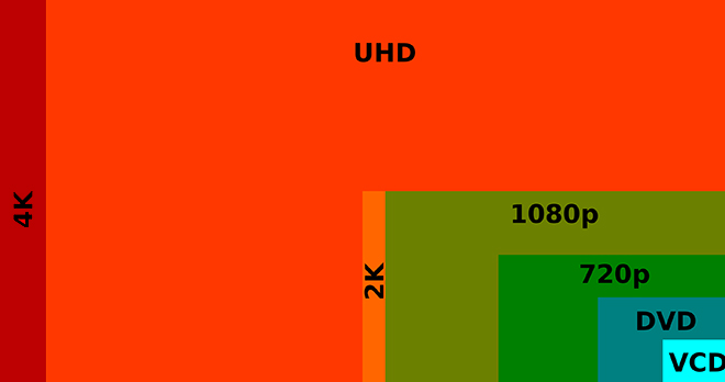 The Eizo CG318-4K has a pixel density of 149 ppi which is well suited for both digital image post production as well as fine art printing applications. If you are used to Apple’s retina displays then you already have a good idea of the performance offered by this sort of pixel density. Regardless, it is well worth taking a couple of minutes to read a short explanation on pixel density and 4K displays courtesy of Eizo’s website. The important take away from this for most users will be to avoid a potentially costly mistake of purchasing a super high pixel density display in the hope of increasing the work space only to realise that magnification has to be used (in order to read text), which means that the work efficiency is effectively the same as before. It is therefore important to select the optimal model with a proper understanding of the features, such as the advantage of super high pixel density displays when it comes to very high definition display and that going with a larger screen size is effective for increasing the work space.
Rather than regurgitate a set of specifications in this review (which are already available on the Eizo website), or present a somewhat spurious set of gamut plots, I am instead going to focus on my impressions of the new Eizo in real world use after working with it in my studio for the last few weeks. My impressions are based on working with images from my Canon EOS1DX 18 MegaPixel Cameras and my Canon EOS 5DSR 50 Mega pixel camera. During my time with the monitor I have been evaluating how the display performs for both processing files and for achieving optimal screen to print matches and will discuss my impressions thus far below. It can be hard to review this kind of product and concisely articulate ones impressions without resorting to superlatives (as so much is subjective once you get past the initial numbers), so please forgive me if I make the occasional subjective statement. This is after all my impression of the display in real world use with my workflow. I am also going to cover the calibration of the display in a short video and demonstrate in a second video the true power of using an Eizo for soft proofing print files; courtesy of the Eizo colour Navigator software. It is this last point that will be of most interest to those of you, who (like me) are interested in making fine art prints of the highest possible quality.
Before I discuss my impressions of working with the new Eizo it is worth addressing the elephant in the room in relation to this monitor and that is the price. At an MSRP of $6000 USD (closer to $7,500 AUD) the Eizo is roughly the equivalent of a fully specified 5k iMac from Apple (without the computer behind it). Or viewed from a different perspective, the iMac comes with a free 5k screen attached. Now, for those of you who are already familiar with the benefits of high end graphics displays such as those from Eizo and NEC you need no explanation of why this is the case. However, if you are new to high end wide gamut graphics displays it is worth taking a moment to understand what it is you are paying for in a screen such as the Eizo CG318-4K and what you are not getting in a 5K iMac screen in comparison.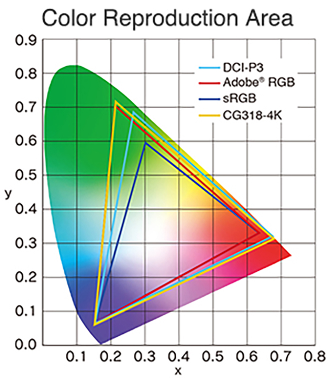 Wide gamut displays such as the Eizo CG318-4K have the capability of displaying a much wider range of colour than the vast majority of computer displays. Most displays (including the 5K iMac) will display colours close to that approximating the SRGB colour space. SRGB is a very small colour space and the default colour space of the internet. It is for all intent and purpose the lowest common denominator in the colour space world. Wide Gamut monitors have the capability of displaying a much wider range of colour (more saturated colours) and typically come close to approximating the Adobe RGB colour space. What this all means in real world terms is the reproduction of much deeper more saturated colours. This enables better rendition of colour tones and better gradation in colour. For image processing and printing this is a key advantage and for photographers is critical to achieving the best possible results. Here in my own studio my wide format Canon printers are capable of producing colours that greatly exceed the SRGB Colour Space (and in some areas even the Adobe RGB Colour Space). The Eizo is capable of rendering these colours on screen and thus I can ensure my images are optimally processed for final print without guess work or test prints.
Another troubling issue for photographers is that the Apple iMac (and other more basic displays) cannot be hardware calibrated. Only a faux software calibration is possible which is a vastly inferior solution. Not to dish out on the 5k iMac too much (I own one of these in my second study area that I use for general internet browsing and email) but its mirror-like display is also a very poor match for making fine art prints, even if the marginal restricted gamut were deemed acceptable. In fact, the first thing you notice about the 5k iMac screen when you sit down in front of it is whatever is directly behind you because it is so reflective. This makes it a very poor choice for high end graphics applications and fine art printing. Now, I grant you that many users and non photographers will find the 5k iMac very pleasing in general use since most general users do not even know what colour gamut means. However, for creative professionals who understand and have a need for a wide gamut display there is simply no comparison.
In terms of both sheer colour range and accuracy of colour reproduction, the CG318-4K performs within a whisker of perfection. Testing shows that 100% of the sRGB spectrum is accurately reproduced, whilst not less than 99% of the Adobe RGB gamut range is also successfully displayed. The much larger Adobe RGB space is much harder to reproduce and most monitors don’t reach even 80% of it (as a reference the 5k iMac produces approximately 78% of the much larger Adobe RGB colour space). There is also the more advanced DCI-P3 (digital cinema color gamut) spectrum and the Eizo manages not less than 98%, according to Eizo (I did not measure this aspect). That’s great news for video editors; who, by the way, can also natively edit RED Epic Camera streams on the Eizo CG318-4K.
Being able to produce all of those colours is not very useful unless a monitor can do it accurately – and here the CG318-4K offers truly superb performance. The measurement of accuracy is referred to as the ‘Delta-E’ . In short, the bigger the number, the more inaccurate the monitor is. My own testing shows the CG318-4K’s average Delta-E is a very small 0.58 and the maximum was .74. This performance is nothing short of exceptional and is unmatched in my experience. The 5K iMac’s average Delta-E by comparison was 1.76 – significantly higher than the CG318-4K’s maximum – with its own maximum being a whopping 5.1. In summary, the CG318K-4K’s accuracy is about as good as you can get, regardless of price.
The colour gamut advantage of displays such as the Eizo are the most commonly known advantage over more typical computer displays for graphics professionals. However, there is another key advantage worth mentioning; which is uniformity. Uniformity refers to the displays ability to maintain even brightness and contrast from one side of the panel to another. The more uniform the brightness the more ‘paper-like’ the appearance of the screen, the easier it is on the eyes and from a photography perspective the easier it is to judge tone and contrast in a given area of an image. Uniformity is extremely important in the reproduction of fine art prints since it ensures an even contrast ratio across the monitor.
Even uniformity is difficult to achieve in back-lit monitors and is often one of the first things you notice in a poor quality display. Monitors that are brightest in the middle and fall off in the corners are common place and are a very poor choice for creative professionals working with digital images. Uniformity can easily be measured and in my own tests I find no measurable difference across the face of the Eizo (which is astounding performance). By comparison the iMac in my study measures a difference of more than a stop from corner to corner. This difference is clearly visible to the naked eye.
CALIBRATION
Unlike most high end graphics displays the Eizo CG318-4K does not require an external instrument or colorimeter to calibrate the display. Rather the Eizo has its own built in instrument that automates and significantly simplifies the process. This might seem like a small trivial thing, but in real world applications this is quite a time saving feature that I have already grown very fond of. With my previous display (an NEC 27” SpectraView II Monitor – also a very fine display) I would have to pull out my colorimeter every couple of weeks or so and recalibrate the screen with the SpectraView II software. This process only takes ten minutes or so, but over a period of time it can become quite tedious and I admit that on occasion I have let a calibration slip past its due date due to sheer laziness. The Eizo takes this calibration and fully automates and schedules the process so that I no longer have to worry about it. I can now sit down in front of my monitor and know it has been calibrated as often as I wish to set the schedule. The calibration sensor is housed inside the top bezel of the screen and swings down onto the screen when calibration is taking place and then swings back up out of the way when not in use. The design and implementation is extremely slick and makes manually placing an instrument on the screen seem positively prehistoric. If the monitor is in standby mode when its time for a scheduled calibration the screen will wake itself up, spend ten minutes warming up and then perform its self calibration function before going back to sleep. A scheduled calibration can be cancelled at any time if its timing interferes with your work. The other key advantage to having a built in sensor is Eizo can ensure the instrument is correctly calibrated and optimised for the display.
Eizo’s Colour Edge Navigator software (ships free with the display) is very easy to set up and use and offers all of the features one could want and need for photographic and video purposes. Also included is Colour Navigator network software for centralised administration of Colour Edge monitors tied to a single network with an enterprise infrastructure. The matching Colour Navigator colour management software that ships with the monitor makes accessing, activating and deactivating specific Colour features (or turning on and off the built in calibration modes) a very simple task. As an interesting aside I was pleased to see the addition of touch sensitive virtual buttons on the monitor in lieu of physical hard press buttons.
For those working with Broadcast and Cinema settings there exist preset modes for EBU, Rec. 709, SMPTE-C and DCI which makes working in any of these colour spaces and gamma values as easy as touching a button on the screen. For even further customisation the in-built calibration sensor and software allows you to adjust the brightness for each of these presets. The customisation options are very thorough and their implementation optimised for just about any workflow. The software is intuitive and very easy to use.
Click on the image below to watch a short video to see Eizo’s Colour Edge Navigator Software in Action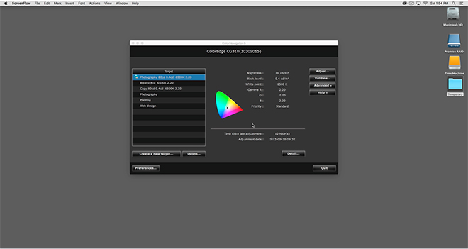 REAL WORLD USE
In Real world use here in my studio the first thing you notice on turning on the display is the incredible resolution that a true 4K screen provides and the subsequent desktop real estate that this resolution enables. I had been concerned that text may be rendered to fine to read but have found that (even though it is small) it is actually quite legible in daily use to my eyes. I suspect your mileage may vary depending on the quality of your vision and viewing distance. In my studio I sit quite close to the monitor and have (as of last test 20/20 vision) no problem reading text on screen without the need for any software scaling. Daily life in a true 4K environment under MAC OS X just works provided you have good enough eye sight to read the small text. If (like me) you like to work on a single monitor then you recognise the high value of having significant desktop real estate; something the Eizo provides in spades. Colour rendition is nothing short of superb on the Eizo and the sheer resolution a true native 4k display offers makes for a powerful and incredible work space.
The other immediate thing I noticed was just how incredibly uniform the brightness is on the Eizo. I am used to working with high end graphic displays and have owned quite a few over the last few years including those from the NEC SpectraView II Line. None of them have hit me with the immediacy of the new Eizo. In side by side comparisons there is a noticeable (although subtle) difference in the uniformity between the Eizo and the NEC 27” SpectraView I have been working with for the last few years. This is not to say the NEC looks bad – far from it. It is just that the Eizo looks ‘smoother’ and more ‘paper-like’. Testing shows the NEC differs by one third of a stop from edge to edge in comparison to the Eizo (which is still excellent performance). The NEC also looks a little soft by comparison to the Eizo in side by side comparisons and clearly suffers from its lower resolution (2560 x 1440) in this regard. A fairer comparison would be to compare the Eizo to the New NEC UHD SpectraView monitor (3840 x 2160), but there was not one available for me to test at the time of this review.
My daily use for a monitor such as the Eizo involves the editing, post production and printing of digital files in Adobe Lightroom and Adobe Photoshop Creative Cloud. I also use applications such as in-Design, Premiere Pro and other image related programs and plug ins. On the whole most of my time is in the majority spent in Lightroom and Photoshop and thus this is the area that my comments are most related.
Working in Adobe Lightroom on the Eizo CG318-4K is an absolute revelation. It has always bothered me that the side panels in Lightroom are fixed and not tear away (yes, they can be hidden, but I prefer tear off). The Eizo has so much screen real estate and resolution to play with on the horizontal access that the fixed panels are now an absolute non issue for me. I used to have to hide the panels to gain resolution for the actual image on the horizontal axis for a standard 35mm ratio image. On the Eizo however, the extra screen real estate provides sufficient resolution to negate this need and the side panels can now be left open all the time. This might seem like a very small benefit, but in real world use its actually extremely beneficial to my workflow. Again, your mileage may vary.
Contrary to what I have read on the internet in various places I experienced absolutely no issues with Lightroom or Photoshop running slowly with a 4K display. I suspect any such issues are almost certainly related to video cards being driven to their limit (and beyond).
Images in Lightroom (and Photoshop) are breathtaking to behold on the 4K Eizo and are rendered with superb clarity. In fact, even bad (noisy) images look good on this display and I have caught myself starting to process images that I would have potentially glossed over on my previous display. The resolution is so fine and the images are so sharp and superbly rendered that it is easy to be seduced by the sheer clarity and resolution and loose focus on the content. I would suggest that if you are preparing images for the web it might be worth just proofing them on a lower end monitor to see what they are going to look like to the majority of people on the internet.
Working with images in Lightroom and Photoshop is a joyous experience on the 4K Eizo and its not just because of the incredible resolution this screen offers. The colour rendition is absolutely superb and when combined with the incredible uniformity the Eizo offers it is extremely easy to judge tone and contrast when processing RAW files. Soft proofing images with the 4K Eizo has never been easier thanks to its incredible uniformity and hyper accurate colour (and powerful Colour Navigator Software). For those of you who place a large emphasis on printing (as I do) you will find the Eizo to be absolutely second to none in this regard. With its wide and hyper accurate colour gamut and superb uniformity I now get better print to screen matches than ever before. The Eizo represents (for me) the best display upgrade I have made to date. Yes – I ended up purchasing the display and by way of full disclosure, paid very close to the MSRP.
Eizo’s colour navigator software offers some very advanced features for soft proofing images before making a print including the manual tweaking of individual colour hue as well as white balance and brightness for achieving optimal screen to print matches.
Watch a short video to see the Advanced Soft Proofing Capability of the Eizo CONCLUSION
If you are considering purchasing an Eizo CG318-4k monitor for your image work you should be aware of the potential pitfalls in driving such a high resolution display. To date, there are only a handful of graphics cards capable of fully driving this monitor to its native resolution and Eizo provide a list of those cards and computers as tested on their website HERE (note: There may now be additional video cards on the market that are capable of driving this display not on Eizo’s list). In my studio I am driving the Eizo with the new Apple Mac Pro 2013 (the Trash Can) with dual V500 Video cards. The dual V500 video cards can fully drive the new Eizo at its native resolution at 60Hz via the display port connection. My previous 2010 Mac Pro Server cannot drive this monitor with its standard Apple supplied video card and my late 2013 MacBook Pro also fails to fully drive the Eizo to its native resolution despite Apples specifications to the contrary. The Macbook Pro will drive the screen to UHD resolution however. I therefore recommend you double check your own video card capabilities before purchasing this monitor and if possible arrange a demonstration or test.
Other than the price there really isn’t anything not to like about the Eizo CG-318-4K. I guess I could niggle that the dual HDMI 1.4 ports should really have been HDMI V2. on a monitor of this calibre (which would have provided users more flexibility). However, I am sure the majority of users of this monitor will want to connect it via one of the 1.2 spec. Display ports so as to fully drive the 4K display at 60Hz. In terms of connectivity it is worth noting the nice addition on the side of the monitor of a USB hub with 3 USB 3 ports; including a port suitable for charging devices. It would have also been nice to have some clips for cable management on the back of the monitor; but this is at the end of the day nit picking and a trivial omission.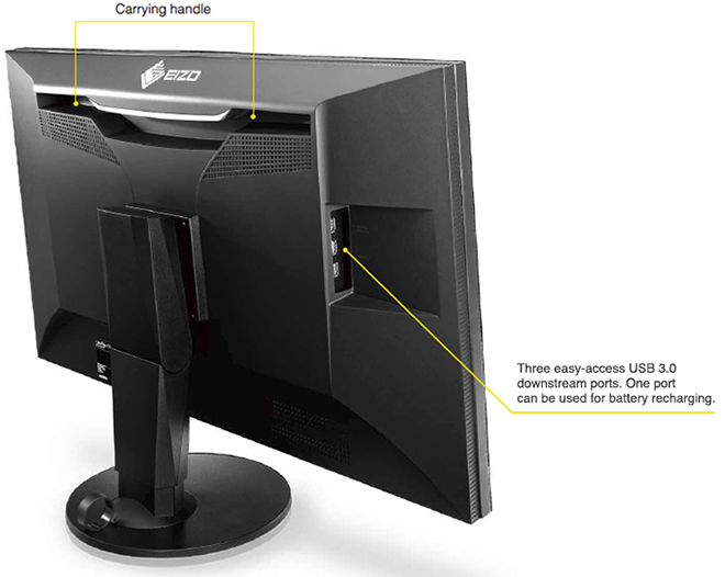 At an MSRP of $6000 USD the Eizo CG318-4K is clearly not for everyone. However, if you are a creative professional or a keen photographer (with the means) who wants and/or needs to work in a 4K wide gamut colour managed environment or requires the highest levels of colour accuracy and uniformity then you will be very well served by the Eizo CG-318-4K. With a 5 Year warranty that includes a zero bright pixels guarantee for a period of six months as well as a 10,000 hour guarantee for colour and brightness, the Eizo represents the current state of the art in graphic displays for creative professionals. The resolution, colour reproduction, accuracy and uniformity are simply superb. Highly recommended if you have the means.
Addendum:
Since I wrote this review Apple have announced a range of new 4k and 5K iMacs. These new iMacs have a quote “wider color gamut” that “makes more of these real-life colors available on the Retina display. A striking 25 percent more.”
With the release of these new iMacs Apple has shifted to the “all‑new” DCI-P3 color space and changed the game. This change will no doubt create some confusion in the market place as users of these new iMacs come to grips with the DCI-P3 color space in their workflows.
The DCI-P3 color space is an RGB color space that was introduced in 2007 by SMPTE. The DCI-P3 color space features a color gamut that is much wider than sRGB and was originally designed for cinema projectors and not displays. The image below shows the relative differences between these color gamuts. In layman terms the Adobe RGB Color space can reproduce more saturated greens that the DCI-P3 color space and the DCI-P3 color space can reproduce more saturated reds.
The Adobe RGB Color space covers approximately 86.98% of the DCI P3 color space. DCI-P3 covers approximately 93.6% of the Adobe RGB color space. However, the DCI-P3 color space uses different green and red primaries to Adobe RGB (but uses the same blue primary) so the measuring stick is quite different.
Eizo quote 98% of the colors in the DCI-P3 Color Space for the CG-318 Display. Apple do not quote a number in their press release for the new iMacs. Apple Press Release. However, Apple do quote “better than 99%” in their ‘reviewers guide’ as reviewed by PC enthusiast website Ars Technica. Screenshot included below. 
What this all means out there in real world workflows remains to be seen. But what is clear at this point (and its a very important point) is that the Eizo CG-318 not only displays 98% of the DCI-P3 color space; but also better than 99% of the Adobe RGB color space and this is the key difference to note on paper between the capabilities of these displays.
 Arctic the Best Photographs is therefore a collection of photographers work (90 different photographers) that was judged to be the best from the 2013 Global Arctic Awards. As such, there is a broad diversity of work throughout the book from many different photographers and the genres range from wildlife to landscape, people, travel and more. I found this diversification of work to be an enjoyable experience as it really showcases how many different aspects there are to life in the Arctic. If you value photography from the Arctic regions you will certainly find many images that will appeal to you. As you would expect for a “Russian photographic publication” the included text is presented in Russian as the first language and the English translation supplied next to it.
 During both expeditions we were fortunate to see and photograph Polar Bears on the pack ice including a number of Bears on recent seal kills. Seeing a Polar Bear on a seal kill is a very rare event and as luck would have it were able to photograph the kills and all aboard were able to capture some really fantastic photographs.
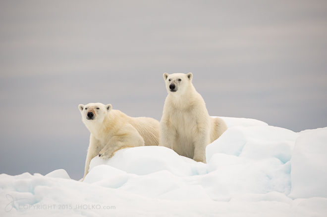 We continued our northerly travels encountering a mix of weather and fog before we arrived into better conditions in the Hinlopen strait. In this area we explored and photographed the spectacular 200 mile+ long glacier face Bråsvellbreen and the plunging bird cliffs at Kapp Fanshawe. The sights and sounds of thousands of nesting birds against such a precipitous cliff is an awe inspiring sight. I have been fortunate to visit this area a number of times now and it never ceases to impress. Bobbing up and down in a zodiac beneath these rock spires, surrounded by thousands of Arctic birds is a very special experience.
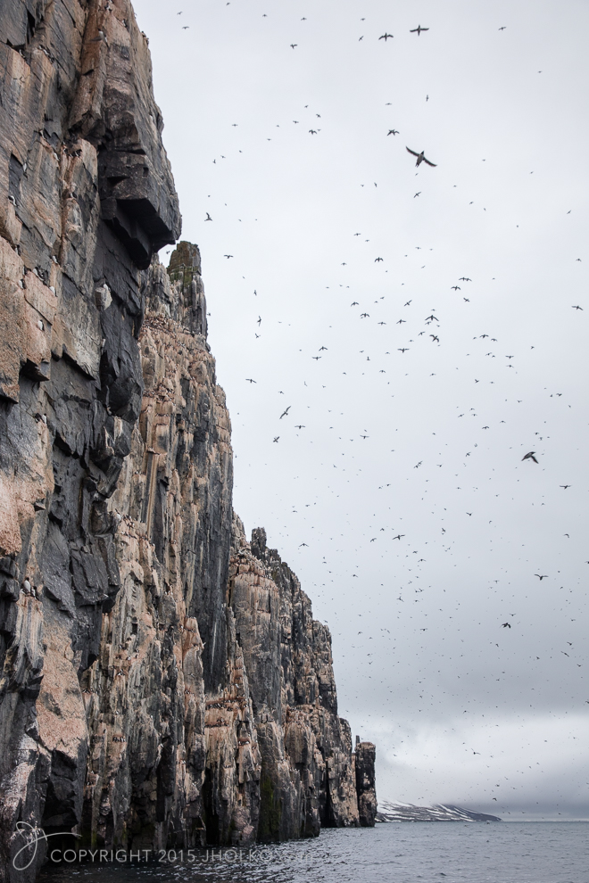 We continued to head north spending the next few days exploring the pack ice and photographing Polar Bears as they jumped from ice flow to ice flow. The Arctic pack ice is a vast area and just finding Polar Bears in this maze of ice can be quite the challenge. We spent many hours scouring the ice with binoculars to find these masters of camouflage. On this expedition our total bear count on the pack ice was eight – with almost all of these being close encounters where we were able to get some really wonderful photographs.
 When it was time to head south again we made several stops in the spectacular Kongsfjorden; where we photographed Arctic Fox cubs and cruised the glacier fronts photographing icebergs, seals and landscapes. We also landed in Poole Pynten where had a wonderful session photographing Walrus in fantastic light. During the expedition we were also fortunate to see and photograph a rare Blue whale (unfortunately I did not get a good photograph). Blue whales are quite tricky to photograph as they rarely reveal to much of their body above the waterline. Nevertheless the experience of seeing this massive mammal is an experience that stays with you forever.
 The second expedition (August 20th – August 30th) saw us set sail from Longyearbyen and head directly north for the pack ice. We made a number of small detours and stops along the way (including a glacier front cruise at Duvefjorden where we encountered three polar bears on some summer melt pack ice) as we dodged some inclement weather before arriving directly on a fresh seal kill with two Polar Bears on the edge of the sea ice – perfect. This was a miraculous find as we had a quickly closing weather window that required us to retreat from the sea ice until the seas calmed and we could return.
 We sought shelter for the evening in the lee of the Seven Islands before resuming our search for Polar Bears on the pack ice. At our furthest northerly most position we were just shy of 82º North – less than 500 Nautical Miles from the North Pole. We cruised the edge of the pack ice for several days photographing the dramatic landscape and had numerous encounters with Polar Bears in fabulous weather.
 Our total Polar Bear count for the first expedition was eight including three bears on kills. Our count on the second expedition was fourteen including another two kills. This was a fabulous result that netted some amazing photographs from all aboard.
 This year saw a dramatic increase in sea ice in the Svalbard region that made finding Polar bears very difficult due to the nature of the ice (lots of ice rubble and very little flat pack ice). It is worth noting that this increase in sea ice is not contrary to global warming evidence (as has been reported elsewhere). This phenomena was merely the result of the polar ice cap (which moves) shifting more toward the Svalbard side of the globe. Overall, the massive reduction in sea ice continues and 2015 saw the Arctic ice pack shrink to record lows. Just as an aside I was extremely pleased to hear in late September this year that Shell has now abandoned its oil and gas exploration drilling in the Arctic for the foreseeable future.
 Both of these expeditions were remarkable trips that provided some truly fabulous photographic opportunities. The high Arctic remains one of the most spectacular locations I have ever visited and I look forward to returning again next year when I will lead another expedition to the pack ice north of Svalbard (and again in 2017) Polar Bears of Svalbard. The expeditions will depart on the 25th of July from Longyearbyen and are dedicated to the photography of Polar Bears living and hunting on the sea ice. If you would like more information about either of these expeditions please drop me an email at